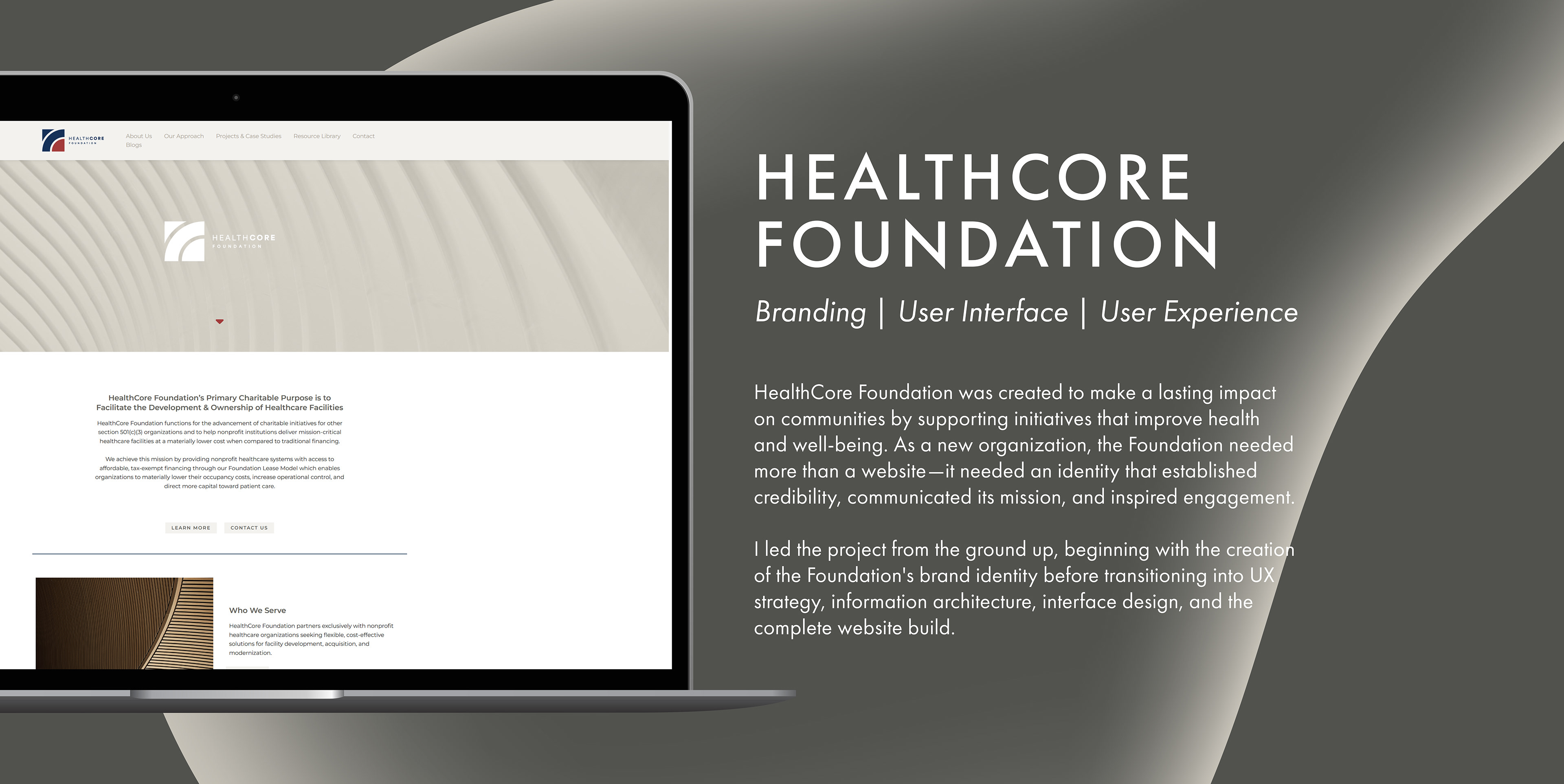
BUILDING THE BRAND
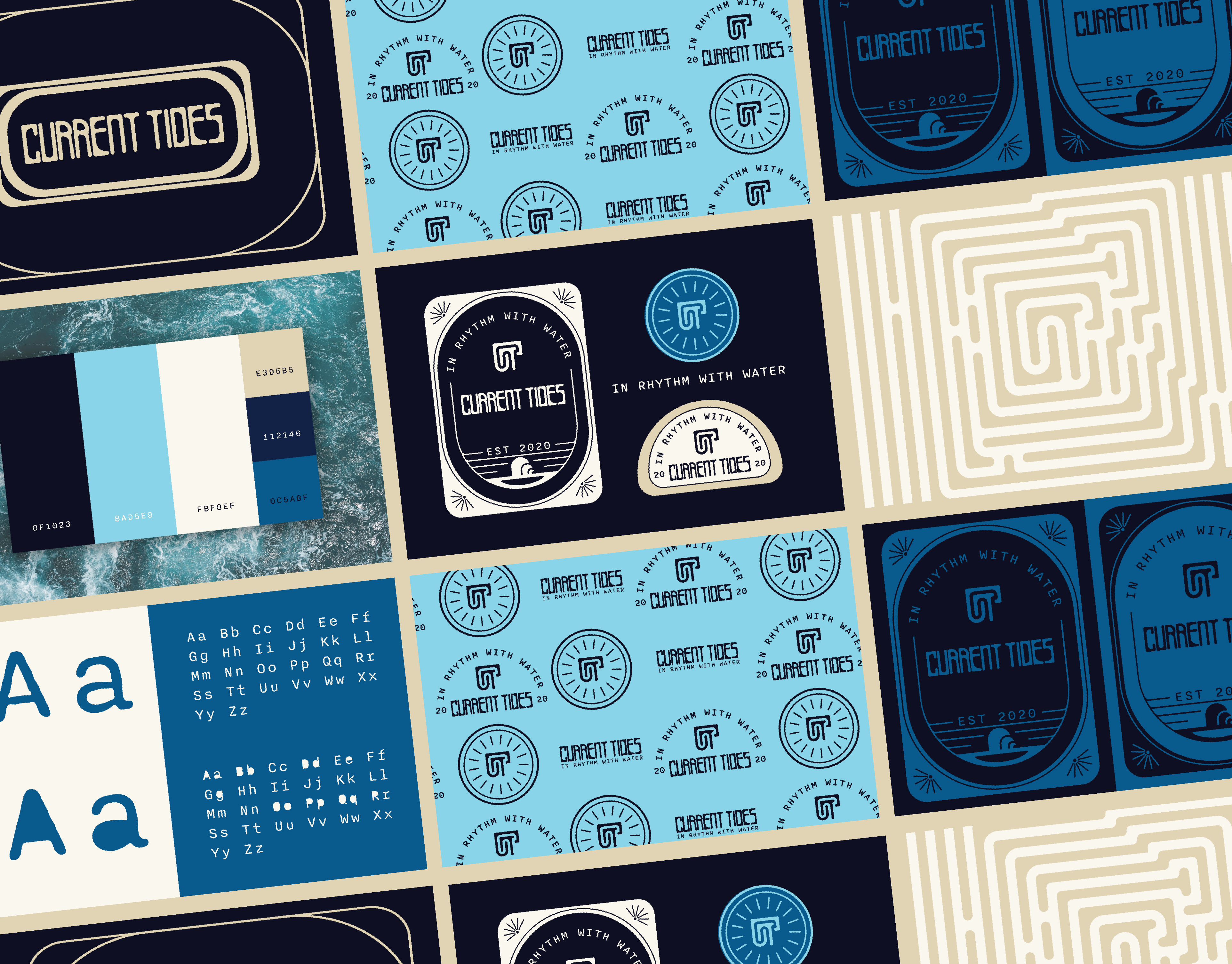
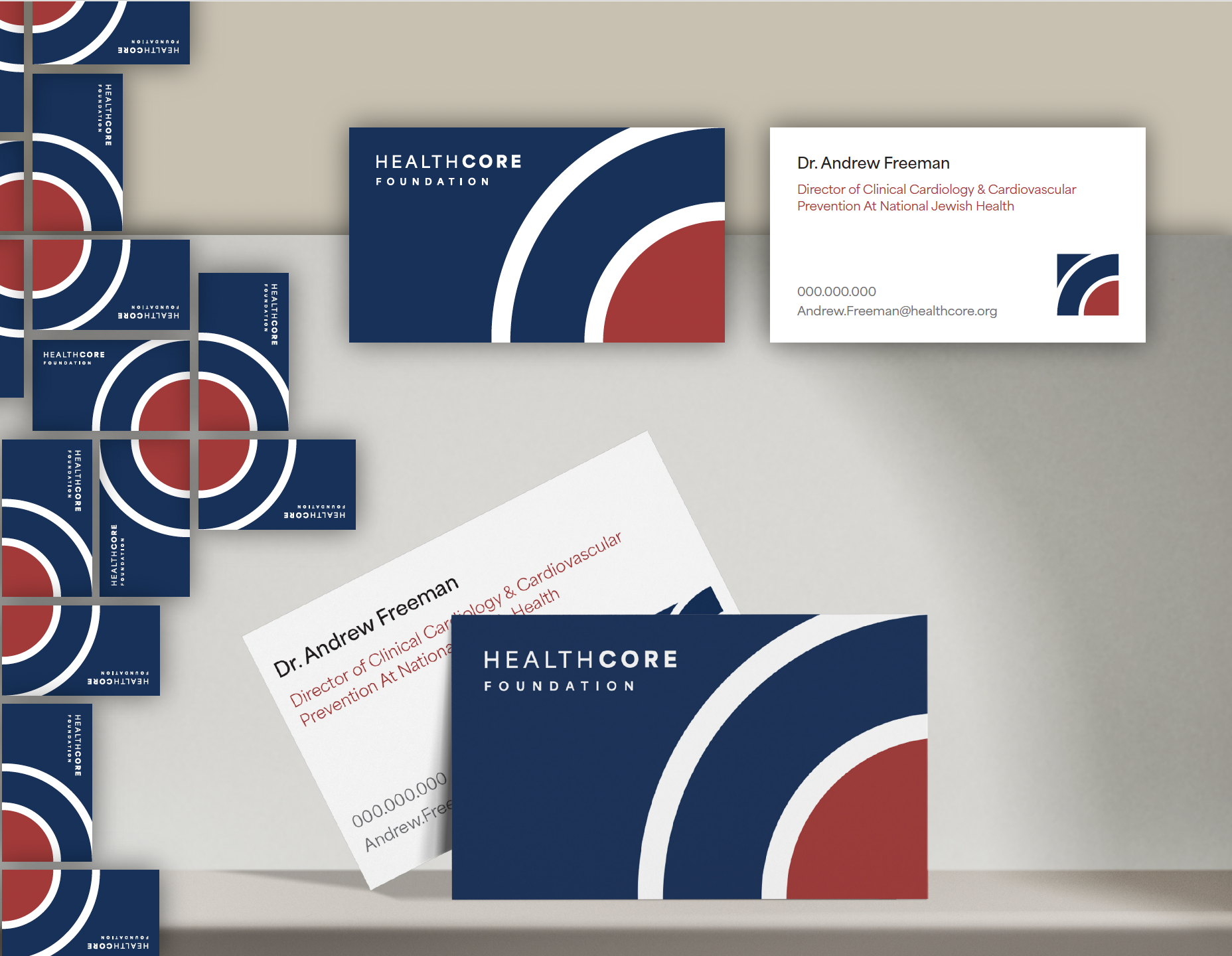
Before designing a single webpage, I focused on establishing a visual identity that reflected the Foundation's purpose. Because healthcare organizations rely heavily on trust, transparency, and professionalism, the branding needed to feel approachable while maintaining a strong sense of credibility.
The identity system and logo was developed around clean typography, a modern color palette, and visual elements that communicate growth, compassion, and innovation. Every design decision was made with consistency in mind so the brand could easily expand across digital platforms and future marketing materials. Creating this foundation early ensured that every touchpoint, from the homepage to individual content sections, felt connected through a unified visual language.
BUILDING THE USER EXPERIENCE
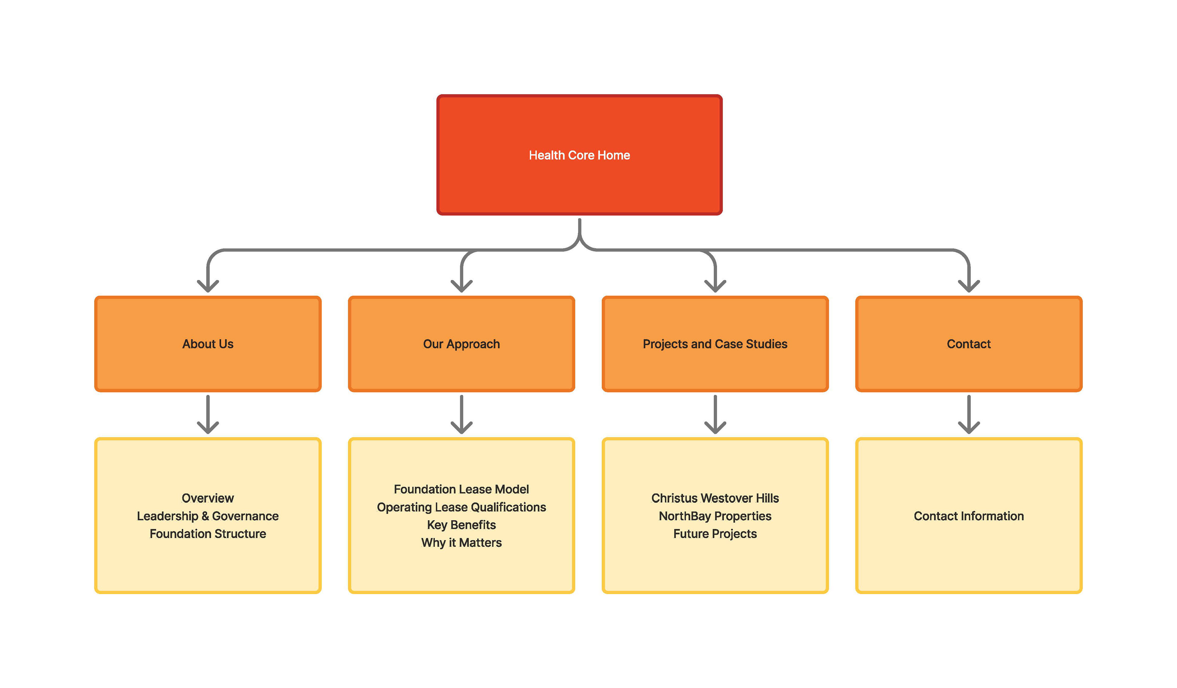
With the brand established, the project shifted toward understanding how visitors would interact with the website. Rather than immediately designing interfaces, I mapped the structure of the site to determine how users would navigate information and accomplish their goals.
The Foundation serves multiple audiences, including potential donors, healthcare partners, community members, and prospective collaborators. Each audience arrives with different questions and motivations, making it essential to organize information in a way that felt intuitive regardless of where users entered the site.
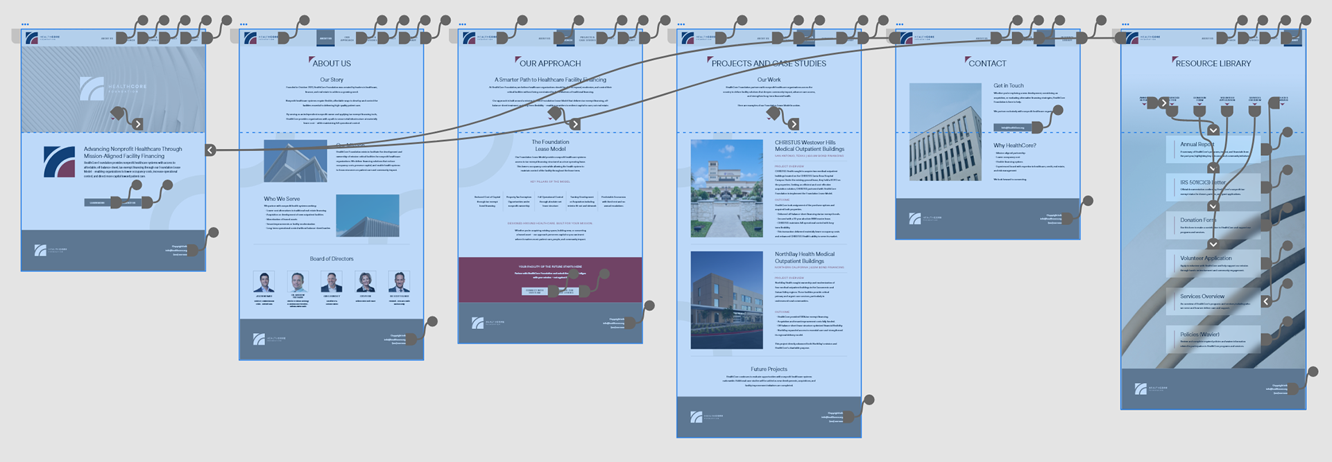
Developing the information architecture allowed me to organize complex content into a logical hierarchy while identifying the primary user journeys. Creating flowcharts early in the process helped visualize how visitors would move throughout the website, making it easier to identify potential friction points before any interface design began. This planning phase became the blueprint for every design decision that followed.
DESIGNING THE INTERFACE
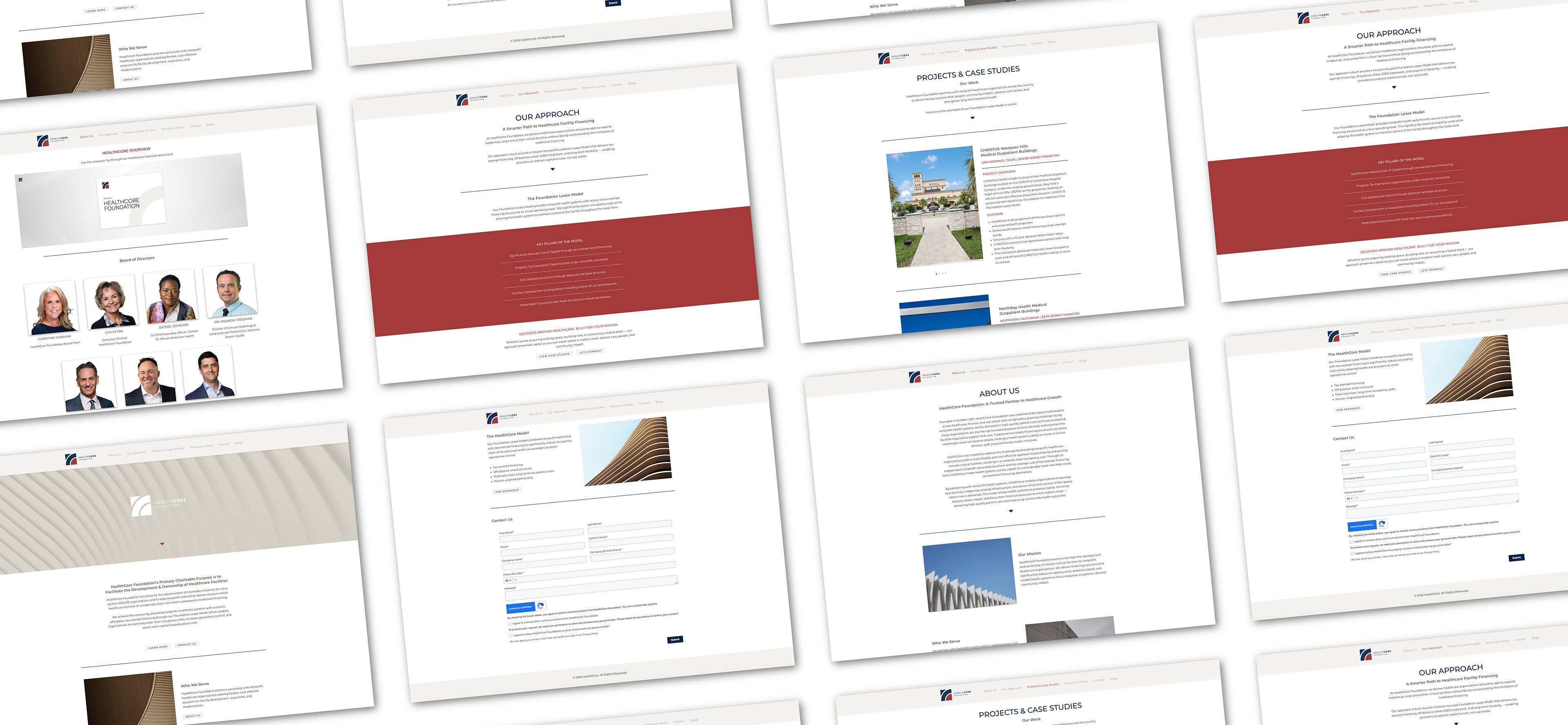
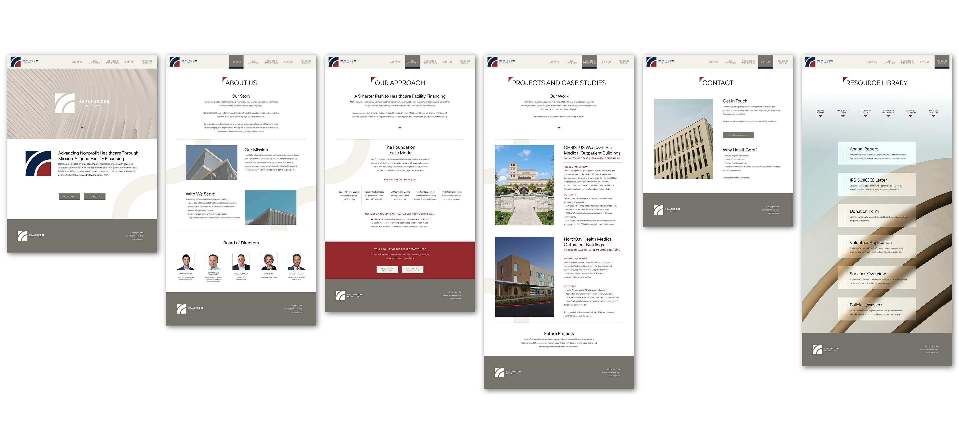
Once the site's structure was established, I translated the user flows into wireframes that prioritized readability, accessibility, and content hierarchy. The layouts focused on creating clear navigation while allowing the Foundation's mission and initiatives to remain the focal point of each page.
As the project evolved into high-fidelity design, the visual identity naturally extended across the interface. Consistent typography, thoughtful spacing, and a restrained color palette created a clean and trustworthy experience that supported rather than distracted from the content. Every component was designed as part of a larger system, allowing layouts to remain flexible and scalable as the organization continues to grow.
The interface balances professionalism with warmth, creating an experience that feels informative while encouraging users to explore the Foundation's work, learn about its impact, and become involved.
BRINGING THE DESIGN TO LIFE
After completing the design phase, I developed the final website, ensuring that the experience translated effectively across desktop and mobile devices. Throughout development, maintaining consistency between the established brand and the implemented interface remained a priority. Careful attention was given to responsive layouts, accessibility, and usability so visitors could easily navigate the site regardless of device.
Building the website myself allowed me to preserve the integrity of the design while refining interactions and visual details throughout the implementation process. This end-to-end involvement strengthened the relationship between strategy, design, and execution.